Colours are currently used much more expressively, regardless of traditional colour harmonies and rules and by using a variety of “loud, “bright” and “unrelated” colours on clothing, furniture, interior, exterior, ceremonial and other designs, artists and designers appear to be breaching colour limits more than ever. Others refer to this activity as colour blogging while many refer to it as colour blocking and due to its relative popularity, we use the term “colour blocking.”
An upholstery sofa with bold colour will add elegance and style to your space with fabrics that are easy to clean as durable sofas are the styling solution to personalise your space but should we opt for neutral colour shades to match new design fads and seasons this New Year 2023 or go for geometric or floral patterns to uplift a dull corner and highlight the way our house looks?
In an interview with HT Lifestyle, Ekant Singh, Founder and CEO at Page2813, answered, “Using a variety of colours in honour of celebrating New Year is a practice that dates back centuries where because of their evergreen quality and vibrant red and green colouring, holly plants were highly valued in ancient Celtic societies, who credited them with keeping Earth looking beautiful even in the dead of winter. Even now, New Year is a great time to celebrate with new upholstery colour choices.”
He suggested, “Teal and salmon, cappuccino and nimbus shower and scorched yellow and pebble moss and mystic lake and cookie dough are some colour schemes I’d propose this season. Together, these colour palettes—which all have something in common with the family of infected mushrooms—create a celebration that is muted but nonetheless brimming with energy. While bold hues will be phased away by 2022, this season’s focus on daring colour combinations has opened a plethora of possibilities for using colour as a means of celebration using upholstery fabrics.”
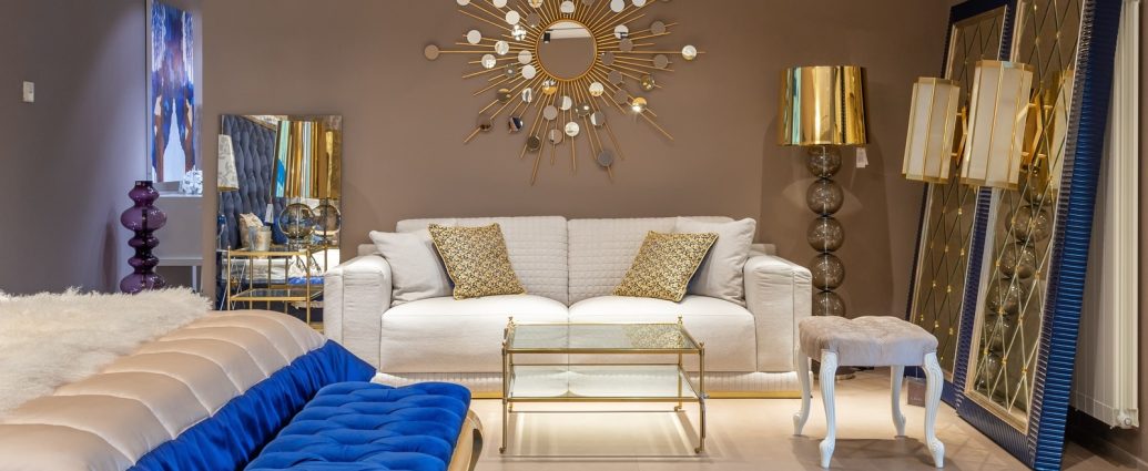
Bringing his expertise to the same, Tushar Mistry, Principal Architect at TMDS, said, “Choosing a colour scheme is the first step in decorating your home for the holidays. Many colour combinations have their own significance and add their own special meaning. Red and green are beautiful together and with a combination of dark gold, they provide sophistication and complement the vibrant conventional colour palette. White and red are also fantastic holiday colours since red is the most important. Using white and lighter reds lightens this wonderful mix. Those who want to avoid reds and greens, as well as themes and hues of red and gold, might choose blue, again a very calming colour with an earthy touch that conveys a coolness to the season.”
He recommended, “Even the use of dark green with browns is a grounded combination and suggests an inviting atmosphere. Due to the dark colours, it evokes the forests and nature which makes for an appealing design. Red, green, brown and orange are fantastic for a colour explosion. Orange brings cheerfulness while red and green enliven the look. Brown is a great fall colour because it grounds and welcomes. Grey and cream lighten this combo. Muted reds, dark greens and light blues provide something different. Since the reds are subdued or pinkish, the green is dark and the light blue balances the colours. It reminds us of sweets, candies, toffees, berries and more that are associated with the festive season.”
He concluded, “You can use nature to replicate the browns, especially if you use recycled materials, woods, different types of wooden furniture or whatever that creates a wonderful vibe. Warm browns and cool blues often look beautiful together, evoking comfort and security. Blue, a cool colour, calms and balances the other colours. Finally, blue and gold. Another great pair is a favourite palette. Royal and naval blues look great with gold and it evokes a sense of feeling protected and recalls a starry night, adding a touch of royalty.”