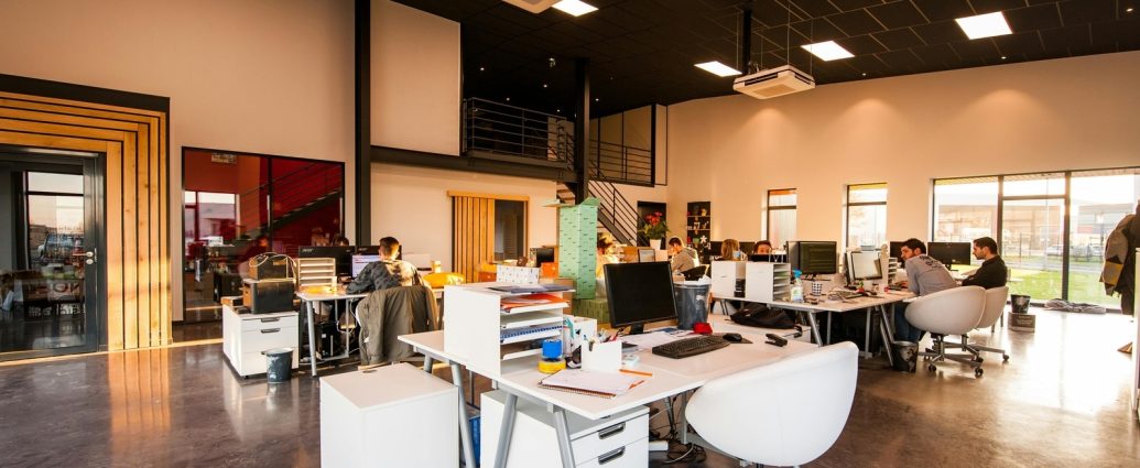
As the days get longer and the temperatures rise, it’s time to find out which interior design trends will be popular this summer. It’s the ideal time of year to update your outdoor and indoor design to match the hottest months of the year. When it comes to designing and building commercial interiors, colour plays a crucial role in making a lasting impression. From vibrant statement walls to carefully artistically curated palettes, colour hues are strategically used to set the mood and enhance different areas of the workplace whilst fostering well-being and enhancing productivity for the employees. As we step into summer, let’s dive into the trends that will define commercial spaces in 2024, with a focus on the shades and tones that will steal the spotlight. (Also read: Unlocking vintage charm: Top 6 tips for adding a timeless touch to your furniture )
Summer Interior Design Trends 2024
Kunal Sharma, Founder and CEO at Flipspaces, shared with HT Lifestyle top shades that are poised to make a splash in the world of design this summer.
1. Ocean Blue
The serene hue tones and their associated colour scheme evoke feelings of peace and tranquillity within environments. In the realm of commercial interior design, it’s important to acknowledge that not every section of the workplace necessitates a vibrant ambience. Specific areas such as reception, break-out rooms or relaxation spots can gain a calming atmosphere that fosters a sense of ease for both visitors and employees.
2. Soft Pastels
Incorporating soft pastel colours into interiors can evoke a feeling of freshness, calmness and timeless beauty. These gentle tones, including soft pinks, lilacs, and muted blues, are frequently selected for their ability to evoke a sense of serenity. These colours are also versatile enough to complement a variety of styles and aesthetics, from classic and romantic to modern and minimalist. Thus, such colour palettes further help bring a soothing and relaxing vibe, making them an impeccable choice for commercial spaces such as wellness retreats and spas.
3. Sunshine Yellow
The lively and optimistic tone of bright yellow naturally instils a strong sense of vibrancy and positivity. It is perfect for areas in a commercial workspace where productivity needs a boost. Integrating this colour via decorative items like wallpapers, frames, chair upholstery, and workstation partitions inject a stimulating and invigorating atmosphere.
4. Vivid Coral
Vivid coral is a hue that catches the eye instantly because of the playful and lively atmosphere it is able to create whilst offering a calming influence. It can be incorporated into commercial environments through wallpapers, decorative accents, and feature walls. This vibrant hue shade is particularly popular in co-working spaces, creating an atmosphere that fosters creativity and collaboration.
5. Natural Green
Biophilic design is undoubtedly one of the most prevalent earthy design tones in commercial spaces, driven by client preferences and the desire to bring nature indoors. In the post-pandemic world where employee well-being and mental health play a pivotal role in the back-to-office (WFO) mode, the use of green primarily aims to enhance the well-being of the workforce by creating a connection with nature. Therefore, it is only fitting to include the colour green in this list. Interior designers have the opportunity to introduce this hue through methods like potted plants, wallpapers, wall art and other imaginative botanical artworks.
